What is Material Design?
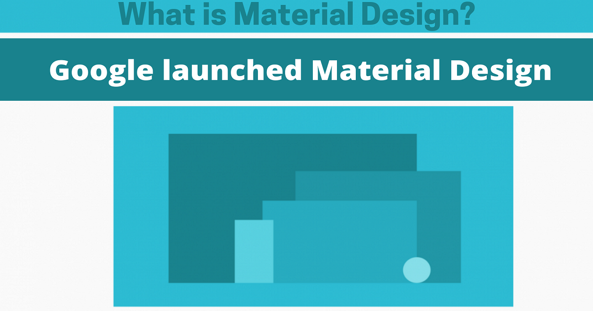
Google launched Material Design, a new design language, in 2014. Instead of using cards, Material Design makes use of grid-based designs with responsive animation. It also uses padding and depth effects like lighting or shadowing to create a more interactive experience on mobile devices.
What exactly is martial Design?
Using cue-rich elements and natural motions that replicate real items, Google has established a design language for Android devices called Material Design, supporting on-screen touch experiences.
According to the design team, users will enjoy immersive, platform-consistent graphics with 3D effects and realistic lighting.
Material Design is always customizable. Material Design now adapts to all form factors, from phones to tabs, computers, and beyond. Updated component behavior and guidance will help your app scale and adapt while keeping layouts consistent and optimal for each device.
Layout and component response is now Material guidelines system capabilities. It is now possible to create interfaces that adapt to changes in screen size and form.
Principles
1. Metaphorically, the material is used.
Physical-world textures, like light reflection and shadow casting, are the inspiration for Material Design. Paper and ink are reimagined as material surfaces.
2. Bold, graphic, and purposeful
The material design uses print design elements such as typographic grids, color scaling, and imagery to immerse users in the interface.
Meanings found in motion.
Because of the modest input it provides and the coherence of its transitions, motion engages attention and maintains continuity. With each element that shows up on the screen, it transforms and reorganizes its surroundings.
3. Components
Each Material Component has its own set of built-in states to communicate attention, selection, activation, error, and disabling conditions. There are libraries for Android, iOS, Flutter, and the web.
Material Design components for creating and developing interfaces. Components cover interface demands such as:
- Display: Arranging content on cards, lists, and sheets.
- Navigation: Allowing users to navigate the product via navigation boxes and tabs.
- Action: Allows users to conduct actions using components like the floating action button.
- Input: Text fields, chips, and selection controls let users enter information or make selections.
- Communication: Using features like snack bars, billboards, and dialogues to alert users to important information.
Theming
With built-in support and advice for modifying colors, typeface styles, and corner forms, Material Theming makes it simple to tailor Material Design to match the look and feel of your company's logo and branding guidelines.
Color, typeface, and shape of Material Components such as buttons can be readily customized to reflect your company's branding guidelines.
Color
Material's color system is a systematic technique to incorporating color into a user interface.
Surface, backdrop, and error are just a few global color styles with meaningful names and specified usage.
Every color has a complementary color used for items that are put "on top" of it to establish uniformity and easily accessible contrast between the two colors.
Typography
The Material Design type scale offers 13 different typography styles for headlines, body text, and captions.
Each style has a distinct meaning and is designed to be used in a specific application inside an interface.
Important elements, such as the typeface, font-weight, and letter case, can be customized to reflect your company's branding and design guidelines.
Shape
Using shapes in your design, you can direct attention to specific components or identify them, describe their status, and represent your brand.
All material elements are classified into shape groups based on the size of their components (small, medium, large). With the help of global styles, you may swiftly change the shape of components of similar size and proportion.
With the shape customization tool, you can create your own shapes with different designs.
Why Users Trust "Material" Interfaces?
Google created Material Design in mid-2014, codenamed “Quantum Paper,” as a new “ink-and-pen” approach. Components that look good and perform like real-world items are the purpose of Material Design.
Unlike subpixel rendering, which depicts culture-relevant elements (e.g., wastebaskets), Material Design applies basic, natural laws from the physical world, primarily lighting and motion.
The concept is that by mimicking the real world, we may minimize users' cognitive demands by optimizing consistency and removing ambiguity. Layering objects and animations are easier with Material Design's "card" idea (e.g., showing followers on Twitter).
Material Design must meet the expectations of users regarding how components should behave to be successful. It is more credible for on-screen objects, for example, if they follow the laws of physics.
It's important to consider the material design.
With this understanding, let's look at how material design may be used in more significant design contexts to make technology more useable.
As a starting point, material design is crucial in flat design.
The concept of flat design or components of it has been discussed for years. Material design is the first big departure from skeuomorphic design, while some aspects of it, such as the idea of material as a metaphor, go back to the early 2000s.
This is a major development.
The less-flat design has made it easy to employ elements for the first time without losing any of the stunning minimalism that flat design is known for.
This means that the user interface is more haptic with material design than with previous design methods. As a result of the material design principles, all things on the screen appear in a three-dimensional matrix rather than in two-dimensional space. This means that objects (such as a text box) truly take up space in the material design world.
As a result of its distinctive design, it is both intuitive and easy to understand for users.
The last reason the material design is important is its scalability.
Initially, the material design was intended for three screen sizes: mobile, tablet, and desktop.
Screen agnostic gestures, for example, were designed to inform users.
It's time to say goodbye.
Google's material design, in our opinion, has been a huge success in terms of improving user experiences.
Instead of flat design, Google's Material Design considers the reality that we all live in the real world. Most significantly, Google has set specific standards that make it easier for web designers to create outstanding user interface designs with ease – and elegance.
